

Building a Proof-of-Work System
Fixing the "Easy Apply" pipeline for job seekers and recruiters

A minimum lovable product to raise the signal in job applications
TL;DR
I built a demo-quality, end-to-end “Proof of Work” assessment flow that sits right after Easy Apply. Candidates complete a short assessment; strong scores get a boost and a shareable card. Recruiters can generate assessments from a JD, approve, publish, and then triage a boosted pipeline. The prototype mirrors LinkedIn’s jobs experience, uses synthetic but functional data, and is intentionally minimal so it stays lovable.
Why build this
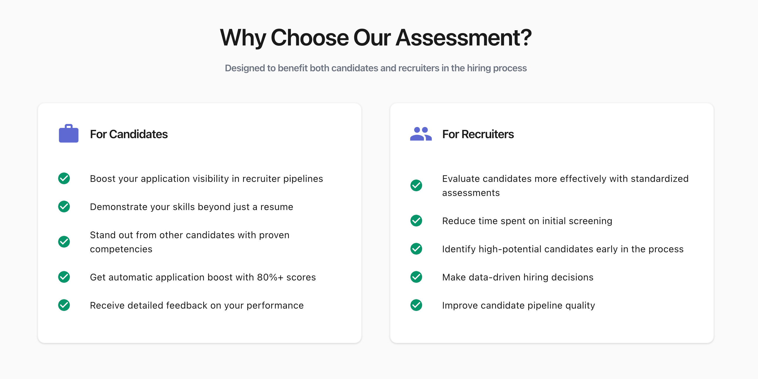
Easy Apply is convenient, but it’s often de-prioritized because it’s a low-signal funnel. The goal was to add a lightweight proof step that increases candidate signal without turning the process into homework.
Design constraints I held myself to:
Keep it minimal and lovable, not maximal and brittle.
Mimic the feel of LinkedIn’s Jobs UI while staying clearly a demo.
Use synthetic data throughout, but keep it functional and consistent.
Ship only what is explicitly defined. No extra seasoning.
Product overview
The project ships in two tightly scoped parts:
1) Candidate experience (post-apply)
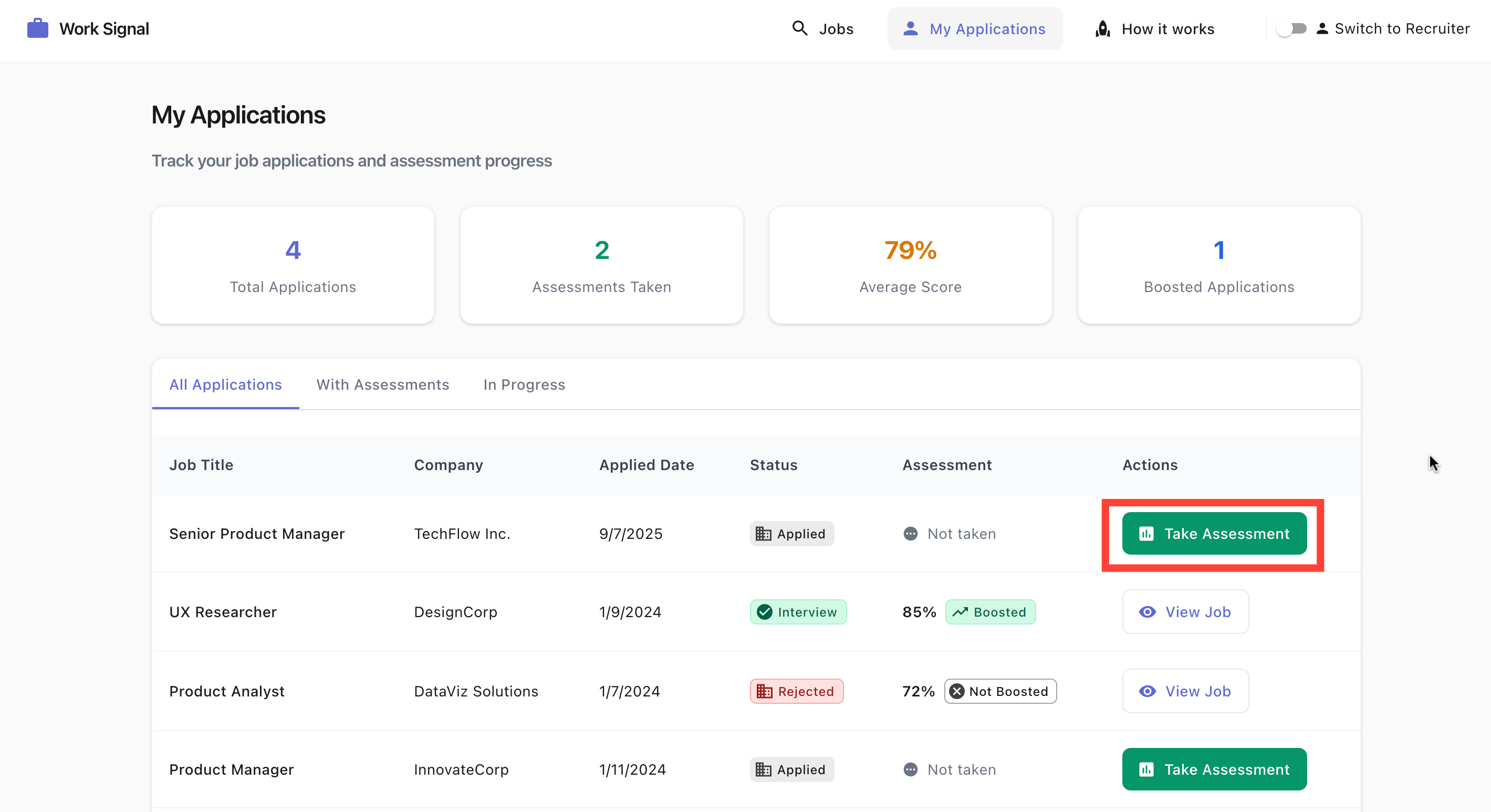
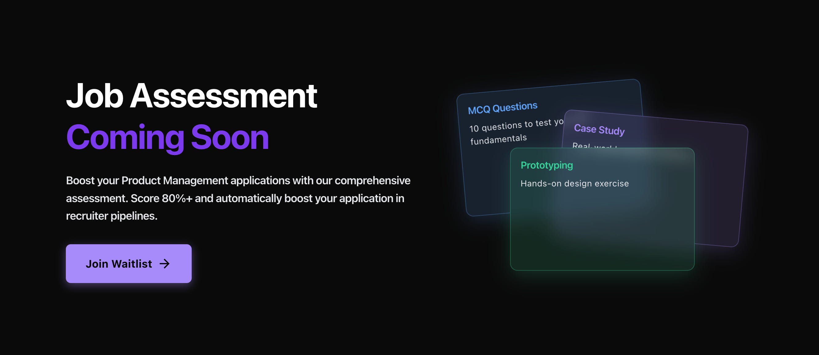
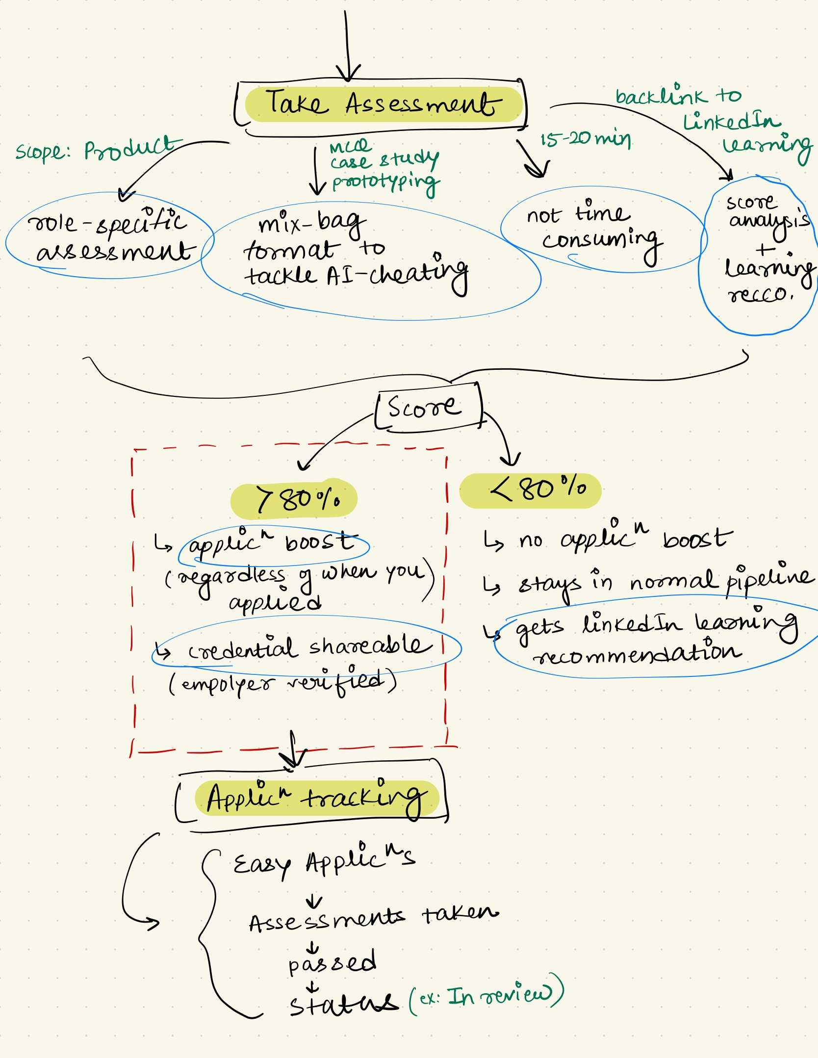
After Easy Apply, candidates see Take POW Assessment. The assessment opens in a new window and includes 8 MCQs, 1 short case, and 1 prototyping upload (low-fi image). Rubric buttons appear for the case and prototype with criteria written to discourage AI-assisted shortcuts. On submission, candidates see their score:
≥ 80% → application boosted + shareable credential card
< 80% → no boost, but show score, analysis, and fake LinkedIn Learning recommendations styled like the real thing
From results, candidates can return to the job, see their score and boost state, and click Track your application to view a list of their Easy Apply submissions. Exactly one item (the one they just took) shows In Review. All data is synthetic, all flows are functional.
2) Recruiter experience (follow-up)
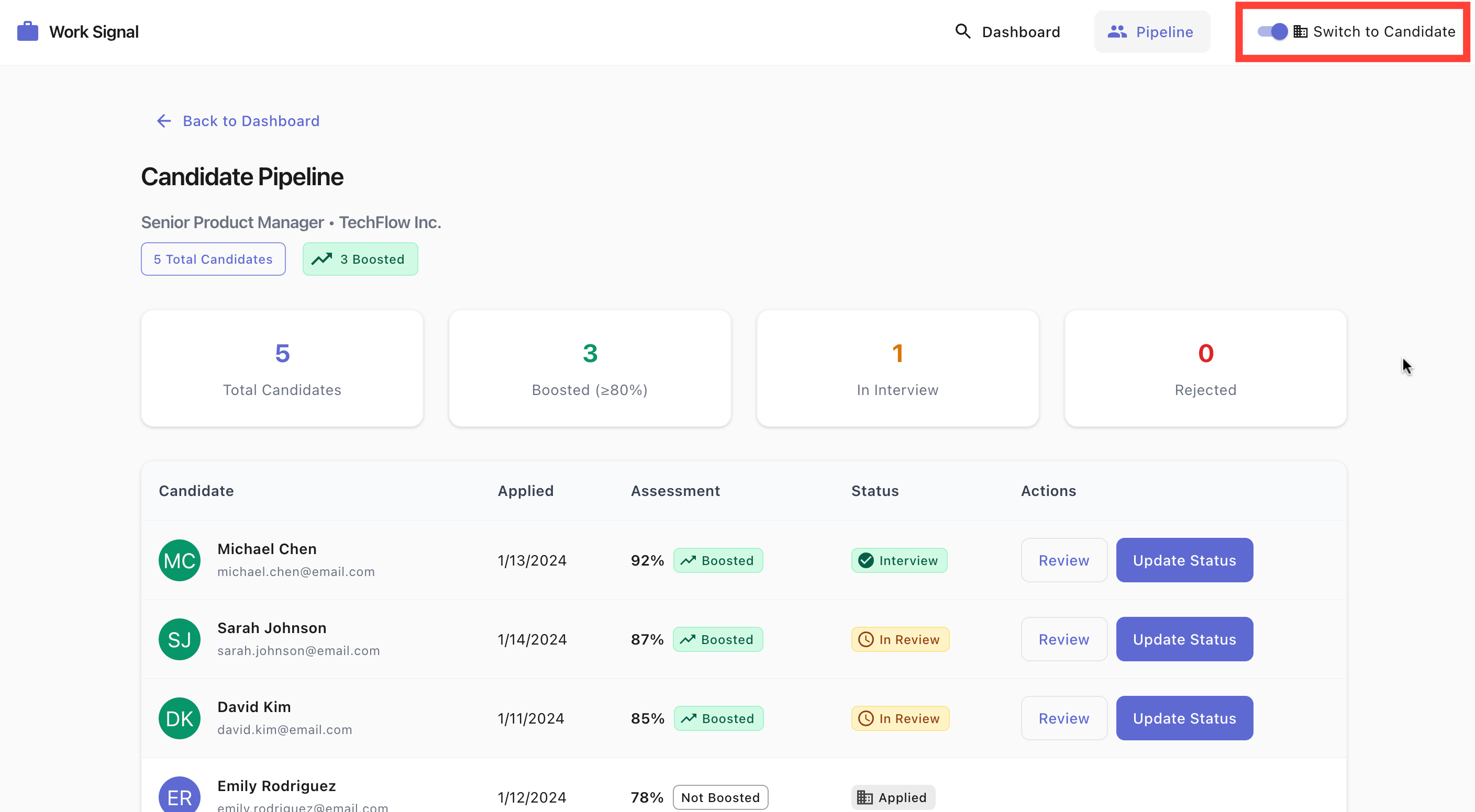
A navbar toggle switches between Recruiter mode & Candidate mode(this is only meant for demo purposes to showcase both ends of the experience: candidate + recruiter).
Recruiters can create Easy Apply jobs, then Create Assessment from the JD (paste or upload PDF). The system generates an assessment and an auto-created, editable rubric. Recruiters review, approve, and publish. Candidates now see Take Assessment on that job.
In the Candidate Pipeline, ≥ 80% scorers appear at the top for priority review. Row actions include Review (PM roles only in this prototype) and a Status Update dropdown with Rejected, Send Interview, or In Review.
What the demo looks and feels like
Visual language: Material Icons, typography and spacing inspired by Linear.
Jobs surface: A mock landing page styled like LinkedIn job listings, with synthetic postings across PM, QA, UXR, and Product Analyst.
Easy Apply: The journey mirrors the LinkedIn sequence and pacing.
Assessment: Loads in a new window with clear sections for MCQs, case, and prototype upload. Rubrics are available on demand.
Results: Distinct states for ≥ 80% and < 80%, including boost messaging, credential share control, and fake Learning tiles.
Tracking: In-app internal redirect (no new tab), showing assessments taken, passed, and statuses. The current run is **In Review**.
Everything is synthetic. Everything is clickable. States persist within the demo.
The Demo
Please feel free to leave a comment if you have any thoughts about the project/product/demo. I would love to work through them. The goal is to get as much feedback as possible.
Thank you if you have reached this far :)
What I optimized for
Signal, not friction: The 15–20 minute design target keeps it lightweight.
Parallel incentives: Candidates who do well are rewarded immediately; recruiters see a cleaner priority queue.
Transparency: Score and analysis are visible to the candidate.
Legibility over cleverness: Linear-inspired typography and Material Icons keep the UI calm and predictable.
What you can view in the prototype
Jobs landing (mock) → Job detail → Easy Apply → Assessment in new window → Results → Job detail updated → Tracking with **In Review**
Recruiter toggle → Job creation → JD paste/PDF → Assessment + auto rubric → Review → Approve → Publish → Candidate Pipeline with boosted rows
Credits and tools
Iconography: Google Material
Design cues: Linear
Data: Synthetic
AI tools: Cursor IDE, ChatGPT, WisprAI
Closing note
This project is a constrained experiment in raising hiring signal without punishing candidates. It respects the reality of Easy Apply while giving recruiters a simple, visible way to prioritize demonstrated skill. The rest is future work, on purpose.
Bonus content:
I always start with visualizing the problem I want to solve. I do my scribbling on an iPad.
Above process gives me clarity. Once I did that, I started describing the application I wanted to build. I spoke into Wispr Flow. I wrote down my entire plan for the application in a google doc with Wispr Flow
Below video is to showcase how the barebones of the application looks like. And how you should strive to build a functional prototype as quickly as possible. Work through iterations.
Let’s talk. I am constantly working(vibe coding) on random product ideas. Maybe we can work on something together :)